


![]()

-
뉴스
-
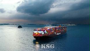
- Hapag-Lloyd Uses Shore Power in the Port of Hamburg
- Hapag-Lloyd, the world’s fifth-largest container shipping company, has signed an agreement with the Hamburg Port Authority (HPA) on the use of shore power in the Port of Hamburg. With this agreement, the company confirms that it will use the available infrastructure ...
-
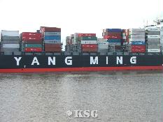
- Yang Ming And Psa International Partner To Advance ...
- Yang Ming Marine Transport Corporation (Yang Ming) and PSA International (PSA) have signed a Memorandum of Understanding (MOU) to jointly accelerate the adoption of low-carbon solutions across the maritime value chain. The agreement was officially signed by Mr Ivan Chi...
-
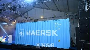
- Union Minister Sonowal Unveils Maersk’s First Ind...
- A.P. Moller – Maersk, the world's leading integrated shipping and logistics company, today achieved a historic milestone in India's maritime sector by becoming the first international shipping line to procure an export-import (EXIM) shipping container man...
-
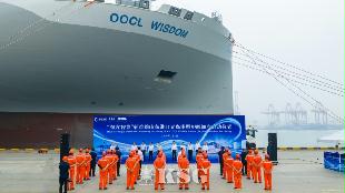
- OOCL Wisdom Completes First Green Methanol Bunkerin...
- ?Orient Overseas Container Line Ltd. (OOCL)'s first methanol dual-fuel containership, OOCL Wisdom, today completed its first green methanol bunkering and commenced its maiden voyage at Qingdao Port, marking another milestone in the company's fleet development a...
-
- 운항스케줄
-
오피니언


2026-06-09 08:50
Interasia Unveils Refreshed Vessel Livery, Bringing a Bolder Brand Presence
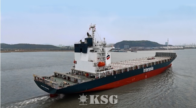
We are pleased to announce our refreshed vessel livery design, introducing a cleaner, bolder, and more recognizable visual identity across our fleet. Guided by the principle of "boldness through simplicity", the new design maximizes the visibility of the Interasia brand while refining the total decorative elements.
“At Interasia, our vessels are more than assets in operation — they are moving expressions of our brand,” said Mr. Brendan, Special Assistant to the Executive Vice President of Interasia. “This refreshed livery reflects who we are today: clear, confident and forward-looking. By simplifying the overall design and strengthening the placement of our symbol and wordmark, we are making Interasia more visible, more consistent and more memorable wherever our vessels call.”
Key new features of the new livery include the Interasia symbol being enlarged and placed on the vessel’s largest available accommodation surface, while the Interasia wordmark now takes a more prominent position along the hull side, together creating a stronger visual presence.
On the bow, a repeated symbol pattern forms a connected chain motif, echoing Interasia’s role in linking ports, customers, and markets across the world.
The design revamp also reflects practical maritime considerations. Colors and placements are selected not only for visual identity, but also for operational visibility, safety, and durability. This ensures that the refreshed livery can maintain a consistent Interasia look while respecting the technical requirements of vessel operations.
The refreshed vessel livery marks another step in Interasia’s ongoing brand evolution, following our continued efforts to strengthen the identity
and present a more unified image across all services, fleet and customer touchpoints. With a sharper visual identity and a simpler, more confident design, Interasia continues to “Move ahead.”— across every route, every port and every voyage.
< Korea Shipping Gazette >

선박운항스케줄
인기 스케줄
-
BUSAN
 ROTTERDAM
선박운항스케줄 목록 - 선박운항스케줄목록으로 Vessel, D-Date, A-Date, Agent를 나타내는 테이블입니다. Vessel D-Date A-Date Agent Ym Throne 08/03 09/22 Tongjin Ym Throne 08/03 09/22 Tongjin One Trust 08/04 09/12 MSC Korea -
BUSAN
CHENNAI선박운항스케줄 목록 - 선박운항스케줄목록으로 Vessel, D-Date, A-Date, Agent를 나타내는 테이블입니다. Vessel D-Date A-Date Agent Xin Tian Jin 07/29 08/18 KMTC Heng Hui 6 07/30 08/20 BEN LINE Kmtc Jebel Ali 07/31 08/19 FARMKO GLS -
BUSAN
MALE선박운항스케줄 목록 - 선박운항스케줄목록으로 Vessel, D-Date, A-Date, Agent를 나타내는 테이블입니다. Vessel D-Date A-Date Agent Oocl Singapore 08/05 09/04 KBA -
BUSAN
SOHAR선박운항스케줄 목록 - 선박운항스케줄목록으로 Vessel, D-Date, A-Date, Agent를 나타내는 테이블입니다. Vessel D-Date A-Date Agent One Maestro 07/28 09/20 BEN LINE Herta 08/03 08/30 SOL Hmm Cebu 08/03 09/04 HMM -
BUSAN
KARACHI선박운항스케줄 목록 - 선박운항스케줄목록으로 Vessel, D-Date, A-Date, Agent를 나타내는 테이블입니다. Vessel D-Date A-Date Agent Hemma Bhum 07/31 08/23 Sinokor Hemma Bhum 07/31 08/24 Kukbo Express Hemma Bhum 07/31 08/25 BEN LINE
- 출발항
-
- 도착항
-


많이 본 기사
- 팬스타, SIPG와 부산-상하이 카페리항로 개척 ‘맞손’국제물류사업협동조합 설립…원제철 초대 이사장 선출[표] 주간 중고선 가격동향CJ대한통운-환경공단, AI 적정포장 검증체계 구축英 웨스트P&I, 올해 보험료 수입 6600억 전망…10%↑한국컨테이너풀, 농수산물 온라인도매시장 수도권 물류센터 운영해수부, 상반기 민간 항만개발사업 2523억 유치인사/ 해양수산부YGPA, 글로벌 선사 대상 여수항 크루즈 유치전[표] 주간 중고선 가격지수
- 국제물류협회, 부산에 영남지회 개소중동항로/ 정세불안 재확대…한국발 운임 7200弗 돌파극동MES, 상반기 경영전략회의서 물류환경 변화 대응방안 논의한중항로/ 상반기 운임 두자릿수 상승한일항로/ ‘팬스타 효과’ 비수기에 시황 호조동남아항로/ 상반기 물동량 204만TEU…역대 4번째한러항로/ 물동량 증가에 운임도 동반 상승한진, ‘K-패션 커넥트’서 해외 진출 물류 컨설팅Yang Ming And Psa International Partner To Advance Sustainable Solutio...Hapag-Lloyd Uses Shore Power in the Port of Hamburg


스케줄 많이 검색한 항구

해사물류 통계 ![]()


COPYRIGHTⓒ 2014 KOREA SHIPPING GAZETTE. ALL RIGHTS RESERVED.
COPYRIGHTⓒ 2015
KOREA SHIPPING GAZETTE. ALL RIGHTS RESERVED.
0/250
확인